Note
Click here to download the full example code
11. Visualizing SHAP across timesteps
This script analyzes the feature importance from a time-series model by visualizing pre-computed SHAP values.
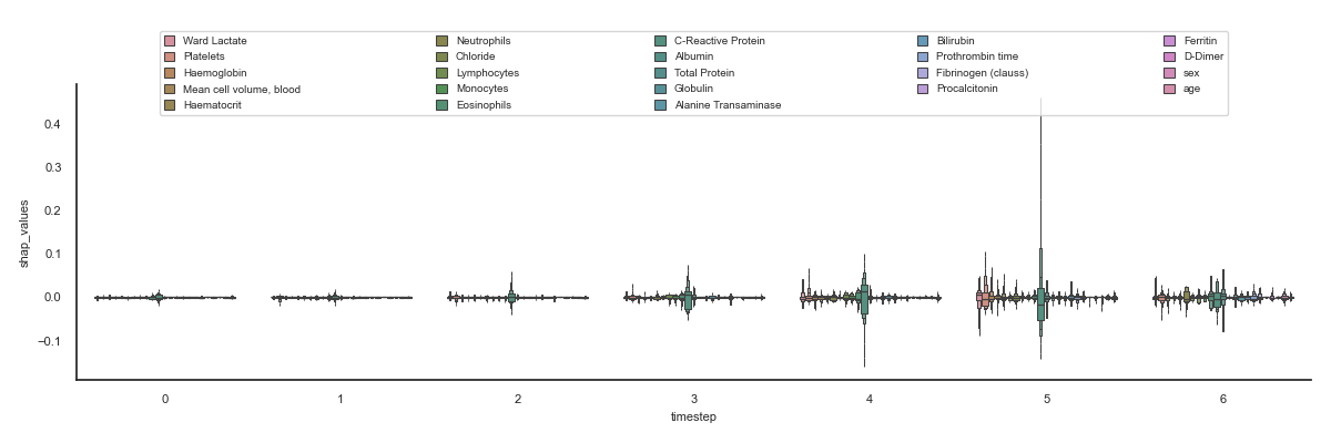
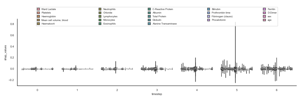
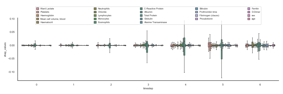
This script loads SHAP (SHapley Additive exPlanations) values from a CSV file to explore feature importance in a temporal context. After filtering for a predefined list of medical features, it generates three distinct Seaborn plots: a boxenplot, a violin plot, and a standard boxplot. Each plot visualizes the distribution of SHAP values for every feature across multiple timesteps. The main objective is to identify which features have the most significant impact on the model’s predictions (indicated by higher SHAP values) and to observe how this influence evolves over time.
Note
See plotly example, were interaction with data is possible!
Out:
    Unnamed: 0  sample  timestep                 features  feature_values  shap_values
0            0       0         0             Ward Lactate             0.0     0.000652
4            4       0         0                Platelets             0.0    -0.001705
5            5       0         0              Haemoglobin             0.0    -0.000918
6            6       0         0  Mean cell volume, blood             0.0    -0.000654
7            7       0         0              Haematocrit             0.0    -0.000487
16          16       0         0              Neutrophils             0.0     0.002521
17          17       0         0                 Chloride             0.0    -0.000858
18          18       0         0              Lymphocytes             0.0    -0.002920
19          19       0         0                Monocytes             0.0    -0.002224
20          20       0         0              Eosinophils             0.0    -0.005246
C:\Users\kelda\Desktop\repositories\github\python-spare-code\main\examples\matplotlib\plot_main30_boxplot_sepsis_shap.py:125: UserWarning:

FigureCanvasAgg is non-interactive, and thus cannot be shown
 22 # Libraries
 23 import seaborn as sns
 24 import pandas as pd
 25 import numpy as np
 26 import matplotlib as mpl
 27 import matplotlib.pyplot as plt
 28
 29 from scipy import stats
 30 from matplotlib.colors import LogNorm
 31
 32 sns.set_theme(style="white")
 33
 34 # See https://matplotlib.org/devdocs/users/explain/customizing.html
 35 mpl.rcParams['axes.titlesize'] = 8
 36 mpl.rcParams['axes.labelsize'] = 8
 37 mpl.rcParams['xtick.labelsize'] = 8
 38 mpl.rcParams['ytick.labelsize'] = 8
 39 mpl.rcParams['legend.fontsize'] = 7
 40 mpl.rcParams['legend.handlelength'] = 1
 41 mpl.rcParams['legend.handleheight'] = 1
 42 mpl.rcParams['legend.loc'] = 'upper left'
 43
 44 # Features
 45 features = [
 46     'Ward Lactate',
 47     #'Ward Glucose',
 48     #'Ward sO2',
 49     #'White blood cell count, blood',
 50     'Platelets',
 51     'Haemoglobin',
 52     'Mean cell volume, blood',
 53     'Haematocrit',
 54     #'Mean cell haemoglobin conc, blood',
 55     #'Mean cell haemoglobin level, blood',
 56     #'Red blood cell count, blood',
 57     #'Red blood cell distribution width',
 58     #'Creatinine',
 59     #'Urea level, blood',
 60     #'Potassium',
 61     #'Sodium',
 62     'Neutrophils',
 63     'Chloride',
 64     'Lymphocytes',
 65     'Monocytes',
 66     'Eosinophils',
 67     'C-Reactive Protein',
 68     'Albumin',
 69     #'Alkaline Phosphatase',
 70     #'Glucose POCT Strip Blood',
 71     'Total Protein',
 72     'Globulin',
 73     'Alanine Transaminase',
 74     'Bilirubin',
 75     'Prothrombin time',
 76     'Fibrinogen (clauss)',
 77     'Procalcitonin',
 78     'Ferritin',
 79     'D-Dimer',
 80     'sex',
 81     'age'
 82 ]
 83
 84 # Load data
 85 data = pd.read_csv('../../datasets/shap/shap.csv')
 86
 87 # Filter
 88 data = data[data.features.isin(features)]
 89
 90 # Show
 91 print(data.head(10))
 92
 93
 94 # .. todo:: Change flier size, cmap, ...
 95
 96
 97 def configure_ax(ax):
 98     sns.despine(ax=ax)
 99     lg = ax.legend(loc='upper center',
100                    bbox_to_anchor=(0.05, 1.15, 0.9, 0.1),
101                    borderaxespad=2, ncol=5, mode='expand')
102     plt.tight_layout()
103
104 # Boxenplot
105 plt.figure(figsize=(12, 4))
106 ax = sns.boxenplot(data, x='timestep', y='shap_values',
107     hue='features', saturation=0.5, showfliers=False)
108 configure_ax(ax)
109
110 # Violinplot
111 plt.figure(figsize=(12, 4))
112 ax = sns.violinplot(data, x='timestep', y='shap_values',
113     hue='features', saturation=0.5)
114 configure_ax(ax)
115
116 # Boxplot
117 plt.figure(figsize=(12, 4))
118 ax = sns.boxplot(data, x='timestep', y='shap_values',
119     hue='features', saturation=0.5, showfliers=False,
120     whis=1.0)
121 configure_ax(ax)
122
123
124 # Show
125 plt.show()
Total running time of the script: ( 0 minutes 5.925 seconds)