Note
Click here to download the full example code
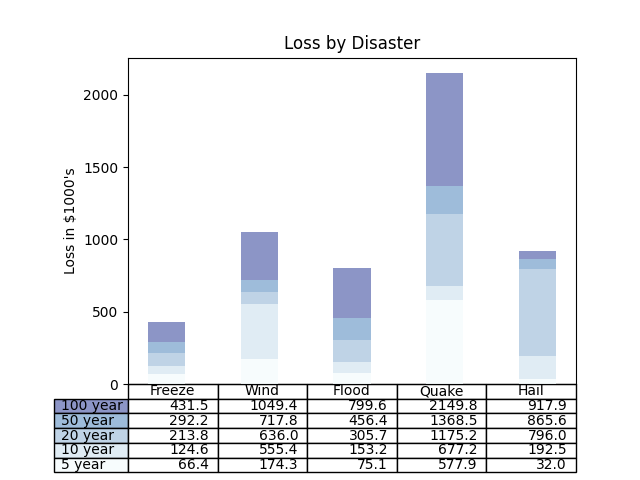
08. Stacked bar chart with data table
This script demonstrates how to create a composite visualization in Matplotlib by combining a stacked bar chart with a data table directly on the same axes. This is an effective way to present both a visual summary and the precise underlying data in a single figure.
The example shows how to:
Build a stacked bar chart by plotting data series sequentially.
Use
plt.tableto add a formatted table below the chart.Synchronize the table’s row colors with the colors of the bar segments for easy visual reference.
Out:
C:\Users\kelda\Desktop\repositories\github\python-spare-code\main\examples\matplotlib\plot_main08_table.py:72: UserWarning:

FigureCanvasAgg is non-interactive, and thus cannot be shown
19 # ``plt.bar`` with ``plt.table``
20
21 import numpy as np
22 import matplotlib.pyplot as plt
23
24
25 data = [[ 66386, 174296,  75131, 577908,  32015],
26         [ 58230, 381139,  78045,  99308, 160454],
27         [ 89135,  80552, 152558, 497981, 603535],
28         [ 78415,  81858, 150656, 193263,  69638],
29         [139361, 331509, 343164, 781380,  52269]]
30
31 columns = ('Freeze', 'Wind', 'Flood', 'Quake', 'Hail')
32 rows = ['%d year' % x for x in (100, 50, 20, 10, 5)]
33
34 values = np.arange(0, 2500, 500)
35 value_increment = 1000
36
37 # Get some pastel shades for the colors
38 colors = plt.cm.BuPu(np.linspace(0, 0.5, len(rows)))
39 n_rows = len(data)
40
41 index = np.arange(len(columns)) + 0.3
42 bar_width = 0.4
43
44 # Initialize the vertical-offset for the stacked bar chart.
45 y_offset = np.zeros(len(columns))
46
47 # Plot bars and create text labels for the table
48 cell_text = []
49 for row in range(n_rows):
50     plt.bar(index, data[row], bar_width, bottom=y_offset, color=colors[row])
51     y_offset = y_offset + data[row]
52     cell_text.append(['%1.1f' % (x / 1000.0) for x in y_offset])
53 # Reverse colors and text labels to display the last value at the top.
54 colors = colors[::-1]
55 cell_text.reverse()
56
57 # Add a table at the bottom of the axes
58 the_table = plt.table(cellText=cell_text,
59                       rowLabels=rows,
60                       rowColours=colors,
61                       colLabels=columns,
62                       loc='bottom')
63
64 # Adjust layout to make room for the table:
65 plt.subplots_adjust(left=0.2, bottom=0.2)
66
67 plt.ylabel(f"Loss in ${value_increment}'s")
68 plt.yticks(values * value_increment, ['%d' % val for val in values])
69 plt.xticks([])
70 plt.title('Loss by Disaster')
71
72 plt.show()
Total running time of the script: ( 0 minutes 0.094 seconds)