Note
Click here to download the full example code
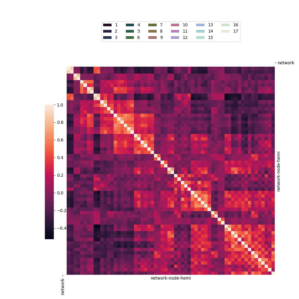
05.b sns.clustermap with network.csv
This script demonstrates an advanced use of seaborn.clustermap
to visualize a correlation matrix from the “brain_networks”
dataset. 🧠 Its main purpose is to show how to add categorical
color annotations to rows and columns. It features a clever
workaround to create a proper legend for these annotations by
plotting invisible bars, resulting in a polished and informative
heatmap.
Note
The hierarchical clustering has been deactivated.
Out:
C:\Users\kelda\Desktop\repositories\github\python-spare-code\main\examples\matplotlib\plot_main05_b_clustermap.py:54: UserWarning:

FigureCanvasAgg is non-interactive, and thus cannot be shown
17 import pandas as pd
18 import seaborn as sns
19 import matplotlib.pyplot as plt
20
21 # Load dataset
22 networks = sns.load_dataset("brain_networks",
23     index_col=0, header=[0, 1, 2])
24
25 # Create variables
26 network_labels = networks.columns.get_level_values("network")
27 network_pal = sns.cubehelix_palette(
28     network_labels.unique().size,
29     light=.9, dark=.1, reverse=True,
30     start=1, rot=-2)
31 network_lut = dict(zip(map(str, network_labels.unique()), network_pal))
32 network_colors = pd.Series(network_labels).map(network_lut)
33
34 # The side colors are drawn with a heatmap, which matplotlib thinks
35 # of as quantitative data and thus there's not a straightforward way
36 # to get a legend directly from it. Instead of that, we'll add an
37 # invisible barplot with the right colors and labels, then add a
38 # legend for that.
39 g = sns.clustermap(networks.corr(),
40     row_cluster=False, col_cluster=False,                 # turn-off clustering
41     row_colors=network_colors, col_colors=network_colors, # add class labels
42     linewidths=0, xticklabels=False, yticklabels=False)   # improve visual wih many rows
43
44 for label in network_labels.unique():
45     g.ax_col_dendrogram.bar(0, 0,
46         color=network_lut[label],
47         label=label, linewidth=0)
48
49 # Move the colorbar to the empty space.
50 g.ax_col_dendrogram.legend(loc="center", ncol=6)
51 g.cax.set_position([.15, .2, .03, .45])
52
53 # Show
54 plt.show()
Total running time of the script: ( 0 minutes 0.362 seconds)